Visual content
Often while writing content, I’m given the opportunity to solve a problem that might require more than copy changes. Here are two examples that were well-received and implemented.
Problem
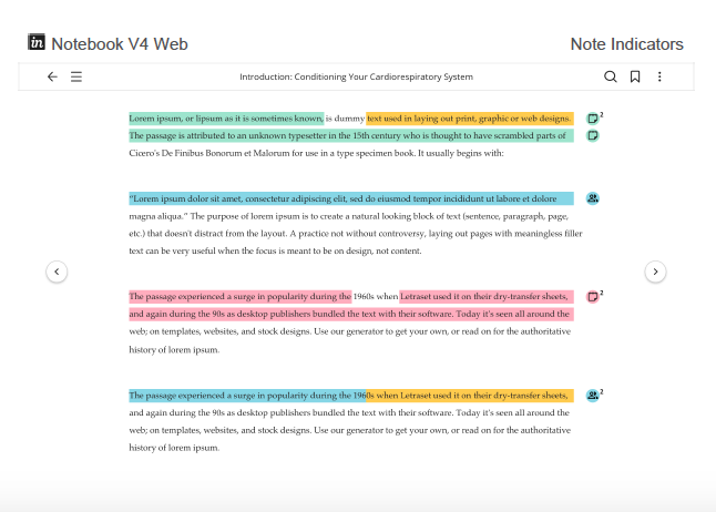
We couldn’t fit the note icon in the margin on mobile. The icon is used to indicate highlights with notes and is shown in the following Web design.
Team
UX design, visual design, product marketing

Solution
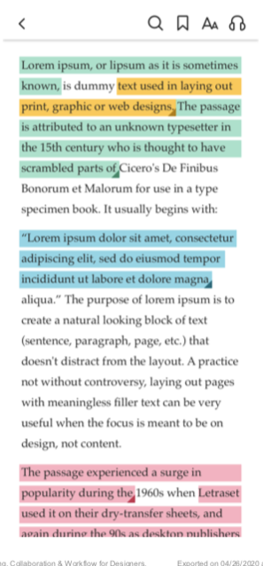
I suggested that we use the triangle image (from the original note icon) to indicate the highlights with notes at the end of each highlight instead of in the margin. The following screen capture shows how it turned out.

Problem
Pearson sells tests that can be administered by people who are trained to proctor and distribute them. Users who are associated with an institution have access to different levels of tests based on whether they are accredited to administer them.
Pearson needs to know whether the associated institution is accredited before the user can continue to purchase products.
Team
UX design and product owner
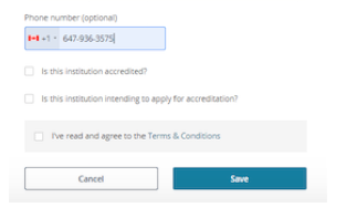
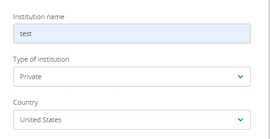
Original design

Good to know
The original form is long, so I included only the applicable sections.
Proposed solution

- Add a new Accreditation field that contains new accreditation options
- Move this new field just after the Type field
- Include these options in the dropdown
- Already accredited
- Intend to apply
- Do not intend to apply
Good to know
I never received the updated form. I often got one-offs from the practitioner side of pearson.com and just worked with the product owner on solving a single problem.