Content simplified
Content examples for practitioners and students
Problem
Sometimes I just needed to simplify existing content. The concept of accounts for users who purchase test materials (i.e. practitioners) is REALLY complicated.
This image includes the original copy.

Team
Product owner
Solution
After multiple conversations to better understand how these accounts work and what the user REALLY needs to know, I suggested this copy:
Select an account
Start with an organization name for the most flexibility in purchase options. Only select My account to make a personal purchase or update this account.
Good to know:
- Despite the original copy, there is no “my own personal account” option.
- I didn’t include the account choices to keep this example simple.
Another example
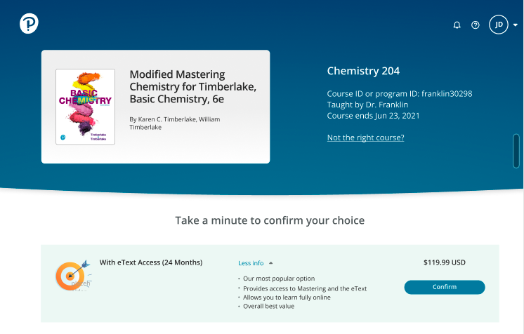
Here are a couple of other examples that use simplified copy. Not the right course? used to be Join a different course.

Good to know:
- Join isn’t a term we use anywhere else in the product. The student might not be able to immediately access a different course. The Not the right course? link takes them to instructions for what to do about this.
- We also needed to work around a technical limitation and force the student to select a button from this page to get to the right screen. I wrote Take a minute to confirm your choice in the hopes it sounds like something they might want to do.
- I didn’t write the marketing copy.
- I have edit privileges in Figma projects, so I don’t tend to save the before examples. I simply overwrite the existing copy.
One more…
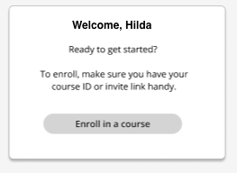
This copy started out with more complex instructions for what the student needs to do with the course ID or invite link. To tell them only what they need to know, I focused on making sure they had access to the course ID or invite link.

Good to know:
- I asked the designer to left-justify the body copy for better readability.
- I suggested that we add an image and move this out of a modal to an empty state page. UX design agreed with this suggestion.